Accessibility Guide
Making a document accessible means that it can be used and understood by everyone. That not only includes people with permanent or temporary disabilities, but also those with different devices or preferences. To underscore why accessibility is important, consider that people might read your document in more contexts than you expected:
- A user may print the document on paper
- A user may read your document on a phone, with reflow in their PDF reader enabled
- A user may have their computer read the document back to them
- A user may ask artificial intelligence to summarize your document for them
- A user may convert your document to another file format like HTML that is more accessible to them
To accommodate all of these people and scenarios, you should design your document for Universal Access. Universal Access is a simple but powerful principle: instead of retrofitting a project for accessibility after the fact, design from the beginning to work for the broadest possible range of people and situations. This will improve the experience for all readers!
Typst can help you to create accessible files that read well on screen readers, look good even when reflowed for a different screen size, and pass automated accessibility checkers. However, to create accessible files, you will have to keep some rules in mind. This guide will help you learn what issues impact accessibility, how to design for Universal Access, and what tools Typst gives you to accomplish this. Much of the guidance here applies to all export targets, but the guide focuses on PDF export. Notable differences to HTML export are called out.
Basics of Accessibility
Accessible files allow software to do more with them than to just render them. Instead, your computer can understand what each part of the document is supposed to represent and use this information to present the document to the user.
This information is consumed by different software to provide access. When exporting a PDF from Typst, the PDF viewer (sometimes also called a reader) will display the document's pages just as you designed them with Typst's preview. Some people rely on Assistive Technology (AT) such as screen readers, braille displays, screen magnifiers, and more for consuming PDF files. In that case, the semantic information in the file is used to adapt the contents of a file into spoken or written text, or into a different visual representation. Other users will make the PDF viewer reflow the file to create a layout similar to a web page: The content will fit the viewport's width and scroll continuously. Finally, some users will repurpose the PDF into another format, for example plain text for ingestion into a Large Language Model (LLM) or HTML. A special form of repurposing is copy and paste where users use the clipboard to extract content from a file to use it in another application.
Accessibility support differs based on viewer and AT. Some combinations work better than others. In our testing, Adobe Acrobat paired with NVDA on Windows and VoiceOver on macOS provided the richest accessibility support. Paired with HTML export, browsers provide a more consistent baseline of accessibility when compared to PDF readers.
Only PDF and HTML export produce accessible files. Neither PNGs nor SVGs are accessible on their own. Both formats can be used in an accessible larger work by providing a textual representation.
Maintaining semantics
To add correct semantic information for AT and repurposing to a file, Typst needs to know what semantic role each part of the file plays. For example, this means that a heading in a compiled PDF should not just be text that is large and bold. Instead, the file should contain the explicit information (known as a tag) that a particular text makes up a heading. A screen reader will then announce it as a heading and allow the user to navigate between headings.
If you are using Typst idiomatically, using the built-in markup and elements, Typst automatically adds tags with rich semantic information to your files. Let's take a look at two code examples:
// ❌ Don't do this
#text(
  size: 16pt,
  weight: "bold",
)[Heading]

// ✅ Do this
#show heading: set text(size: 16pt)
= Heading
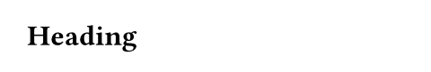
Both of these examples look the same. They both contain the text "Heading" in boldface, sized at 16 point. However, only the second example is accessible. By using the heading markup, Typst knows that the semantic meaning of this text is that of a heading and can propagate that information to the final PDF. In the first example, it just knows that it should use boldface and larger type on otherwise normal text and cannot make the assumption that you meant that to be a heading and not a stylistic choice or some other element like a quote.
Using semantics is not limited to headings. Here are a few more examples for elements you should use:
- Use underscores /
emphinstead of thetextfunction to make text emphasized - Use stars /
stronginstead of the text function to make text carry strong emphasis - Use lists (
list,enum,terms) instead of normal text with newlines when working with itemized or ordered content - Use
quotefor inline and block quotes - Use the built-in
bibliographyandcitefunctions instead of manually printing a bibliography - Use labels and
refor@referencesto reference other parts of your documents instead of just typing out a reference - Use the
captionargument of thefigureelement to provide captions instead of adding them as text below the function call
If you want to style the default appearance of an element, do not replace it with your own custom function. Instead, use set, show-set, and show rules to customize its appearance. Here is an example on how you can change how strong emphasis looks in your document:
// Change how text inside of strong emphasis looks
#show strong: set text(tracking: 0.2em, fill: blue, weight: "black")

When setting up your tents, *never forget* to secure the pegs.
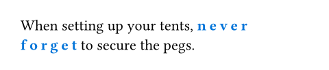
The show-set rule completely changes the default appearance of the strong element, but its semantic meaning will be preserved. If you need even more customization, you can provide show rules with fully custom layout code and Typst will still retain the semantic purpose of the element.
Reading order
For AT to read the contents of a document in the right order and for repurposing applications, accessible files must make their reading order explicit. This is because the logical reading order can differ from layout order. Floating figures are a common example for such a difference: A figure may be relevant to a paragraph in the center of a page but appear at the top or bottom edge. In non-accessible files, PDF readers and AT have to assume that layout order equals the logical reading order, often leading to confusion for AT users. When the reading order is well-defined, screen readers read a footnote or a floating figure immediately where it makes sense.
Fortunately, Typst markup already implies a single reading order. You can assume that Typst documents will read in the order that content has been placed in the markup. For most documents, this is good enough. However, when using the place and move function or floating figures, you must pay special attention to place the function call at an appropriate spot in the logical reading order in markup, even if this has no consequence on the layout. Just ask yourself where you would want a screen reader to announce the content that you are placing.
Layout containers
Typst provides some layout containers like grid, stack, box, columns, and block to visually arrange your content. None of these containers come with any semantic meaning attached. Typst will conserve some of these containers during PDF reflow while other containers will be discarded.
When designing for Universal Access, you need to be aware that AT users often cannot view the visual layout that the container creates. Instead, AT will just read its contents, so it is best to think about these containers as transparent in terms of accessibility. For example, a grid's contents will just be read out flatly, in the order that you have added the cells in the source code. If the layout you created is merely visual and decorative, this is fine. If, however, the layout carries semantic meaning that is apparent to a sighted user viewing the file in a regular PDF reader, it is not accessible. Instead, create an alternative representation of your content that leverages text or wrap your container in the figure element to provide an alternative textual description.
Do not use the grid container to represent tabular data. Instead, use table. Tables are accessible to AT users: their AT will allow them to navigate the table two-dimensionally. Tables are conserved during reflow and repurposing. When creating tables, use the table.header and table.footer elements to mark up the semantic roles of individual rows. The table documentation contains an accessibility section with more information on how to make your tables accessible. Keep in mind that while AT users can access tables, it is often cumbersome to them: Tables are optimized for visual consumption. Being read the contents of a set of cells while having to recall their row and column creates additional mental load. Consider making the core takeaway of the table accessible as text or a caption elsewhere.
Likewise, if you use functions like rotate, scale, and skew, take care that this transformation either has no semantic meaning or that the meaning is available to AT users elsewhere, i.e. in figure alt text or a caption.
Artifacts
Some things on a page have no semantic meaning and are irrelevant to the content of a document. We call these items artifacts. Artifacts are hidden from AT and repurposing and will vanish during reflow. Here are some examples for artifacts:
- The hyphens inserted by automatic hyphenation at the end of a line
- The headers and footers on each page
- A purely decorative page background image
In general, every element on a page must either have some way for AT to announce it or be an artifact for a document to be considered accessible.
Typst automatically tags many layout artifacts such as headers, footers, page back- and foregrounds, and automatic hyphenation as artifacts. However, if you'd like to add purely decorative content to your document, you can use the pdf.artifact function to mark a piece of content as an artifact. If you are unsure if you should mark an element as an artifact, ask yourself this: Would it be purely annoying if a screen reader announced the element to you? Then, it may be an artifact. If, instead, it could be useful to have it announced, then it is not an artifact.
For technical reasons, once in an artifact, content cannot become semantic again. To stack artifacts and semantic contents, use place to move the contents on top of one another.
Please note that Typst will mark shapes and paths like square and circle as artifacts while their content will remain semantically relevant and accessible to AT. If your shapes have a semantic meaning, please wrap them in the figure element to provide an alternative textual description.
Color use and contrast
Universal Access not only means that your documents works with AT, reflow, and repurposing, but also that visual access is possible to everyone, including people with impaired eyesight. Not only does aging often come with worse sight, a significant portion of people have problems differentiating color: About 8% of men and 0.5% of women are color blind.
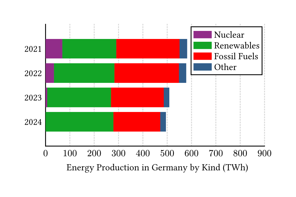
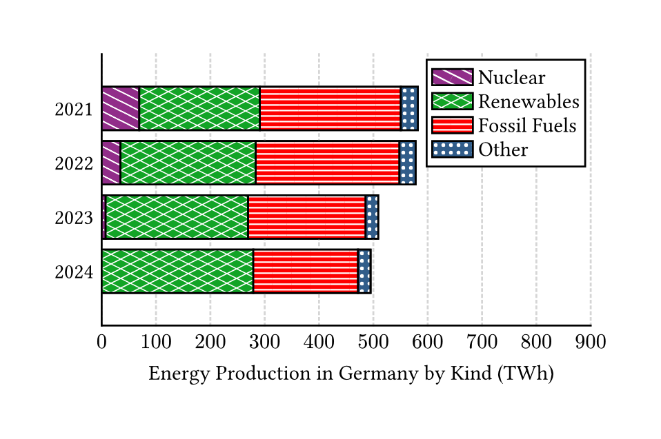
This means that color must not be the only way you make information accessible to sighted users in your documents. As an example, consider a stacked bar chart with multiple colored segments per bar. Our example shows a chart of the domestic energy production in Germany by kind1. In the picture, you can see the chart as it would normally appear and a simulation of how it would appear to people with deuteranopia-type color blindness. You can see that the two pairs of the first and last segment both look blue and the center pair looks yellow-ish. The first challenge for the colorblind user is thus to make out the boundary of the "Renewable" and "Fossil Fuels" bar. Then, they must keep track of which bar is which by only their order, adding to their mental load. A way to make this chart even less accessible would be to make the order of segments not match their order in the legend.
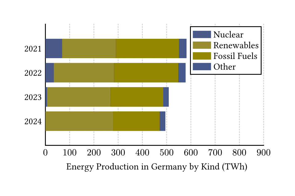
How can we improve the chart? First, make sure that no information is solely communicated through color use. One possible way to do this by adding a pattern to each bar. Then, we can help the user make out the boundaries of each segment by adding a high-contrast border. Then, our chart could look something like this:
This could be further improved by choosing colors that are differentiable to people afflicted by common colorblindness types. There are tools on the web to simulate the color perception of various color blindnesses. You could also iterate on the design by choosing two-tone patterns, aligning them to the bars, or changing font use.
Also consider the color contrast between background and foreground. For example, when you are using light gray text for footnotes, they could become hard to read. Another situation that often leads to low contrast is superimposing text on an image.
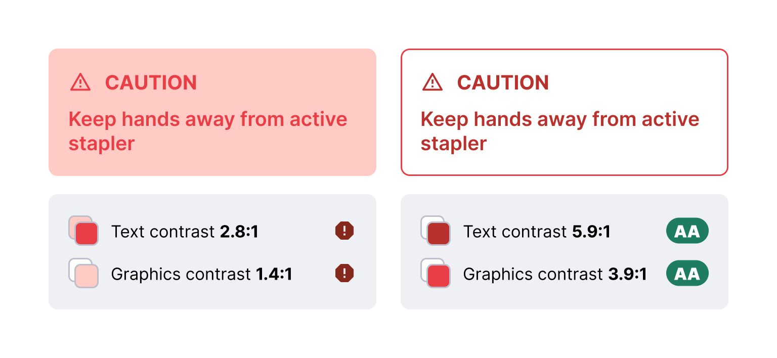
In our example, we can see two designs for callout boxes. Because these boxes aim to help the user avoid a hazard, it is paramount that they can actually read them. However, in the first box, the background is fairly light, making it hard to make out the box. Worse, the red text is difficult to read on the light red background. The text has a 2.8:1 contrast ratio, failing the bar of 4.5:1 contrast the Web Content Accessibility Guidelines (WCAG) set. Likewise, the box has an 1.4:1 contrast ratio with the white page background, falling short of the 3:1 threshold for graphical objects.
Colors in the second example have been adjusted to meet WCAG AA color contrast thresholds. It should be markedly easier to read the text in the box, even if you have good vision!
There are tools to compare how much contrast a pair of colors has as foreground and background. The most common one is the WCAG color contrast ratio. For a given font size, a color pair may either fail the test, get to the AA level, or reach the higher AAA level. Aim for at least AA contrast for all your color pairings.
| Content | AA Ratio | AAA Ratio |
|---|---|---|
| Large text (>=18pt or bold and >=14pt) | 3:1 | 4.5:1 |
| Small text | 4.5:1 | 7:1 |
| Non-text content | 3:1 | 3:1 |
Note that common accessibility frameworks like WCAG make an exception for purely decorative text and logos: Due to their graphic character, they can have contrast ratios that fail to achieve AA contrast ratio.
Textual representations
To support AT use and some repurposing workflows, all elements with a semantic meaning must have a textual representation. Think about it in terms of Universal Access: If an item is not an artifact, it has a semantic meaning. If, however, AT cannot ingest the item, the full semantic meaning of a document is not available to AT users. Hence, to provide Universal Access, use the mechanisms built into Typst to provide alternative representations.
When you add an image, be sure to use the alt argument of the image function to describe what's visible in the image. This alternative description (sometimes known as alt text) should describe the gist of the image: Think about how you would describe the image to a friend if you called them on the phone. To write good alternative descriptions, consider the context in which the image appears:
#image("heron.jpg", alt: "?")

Herons have feet with interdigital
webbing, allowing for good mobility
when swimming, and wings that span
up to 2.3 m.
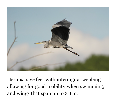
What could be a good alternative description for this image? Let's consider a few examples for what not to do:
-
"Image of a heron"
❌ The screen reader will already announce the image on its own, so saying this is an image is redundant. In this example, the AT user would hear "Image, Image of a heron". -
"A bird"
❌ The alternative description is not specific enough. For example, it is relevant to a user that the image depicts a heron and both its feet and wings are visible. -
"Gray heron in flight. Picture by Makasch1966 on Wikimedia Commons, CC Attribution 4.0 International license"
❌ The alternative description should not include details not visible in the image, such as attribution, jokes, or metadata. Keep in mind that it is not accessible to sighted users. That information belongs elsewhere. -
"Gray heron flying low, heading from the right to left. Its feet are extended and slightly point downwards, touching a blurred horizon where a dark forest becomes visible. The bird's wings are extended and arc upwards. There are out-of-focus branches visible in the lower left corner of the image."
❌ The alternative description is too verbose. Use your discretion and determine how important the image is to the content. Think about how long a sighted user would realistically look at the image; your alt text should take about the same effort to 'consume.' For example, the anatomic description contained above could be appropriate for a longer discussion in a zoology textbook while the compositional information is useful when writing about photography. The context the example image comes with is relatively short, so write a more brief description.
Instead, in the given example, you could use this alternative text:
"Heron in flight with feet and wings spread"
✅ This alternative description describes the image, is relevant to the context, and matches its brevity.
There are resources available on the web to learn more about writing good alternative descriptions. The requirement to add alternative text to images applies to all image formats. Typst does not currently retain the tags of a PDF image in the compiled document, even if the PDF image file on its own was accessible.
Do not use images of text; likewise, do not use the path operations to draw text manually. Typst will not be able to process text in any images to make it accessible in the same way that native text is. There is one exception to this rule: Use an image of text when the appearance of the text is essential to the semantic meaning of the document and cannot be reproduced with Typst natively. In that case, you must describe both the textual content and the essential visual characteristics in the alternative description.
Like the image function, the figure function has a alt attribute. When you use this attribute, many screen readers and other AT will not announce the content inside of the figure and instead just read the alternative description. Your alternative description must be comprehensive enough so that the AT user does not need to access the body of the figure. Only use the alternative description if the content of the figure are not otherwise accessible. For example, do not use the alt attribute of a figure if it contains a table element, but do use it if you used shapes within that come with a semantic meaning. If you specify both alt and caption, both will be read by AT. When your figure contains an image, set the alternative description on the image itself, not on the figure. Do not set both, as the image description would be overridden by the figure description.
#figure(
  alt: "Star with a blue outline",
  curve(
    stroke: blue,
    curve.move((25pt, 0pt)),
    curve.line((10pt, 50pt)),
    curve.line((50pt, 20pt)),
    curve.line((0pt, 20pt)),
    curve.line((40pt, 50pt)),
    curve.close(),
  ),
)
Finally, you can specify an alternative description on math using math.equation. Describe your formula as if read out loud in natural language. Currently, adding an alternative description is required for accessible math for all export formats. Not adding an alternative description for your formula will result in a failure of PDF/UA-1 export. In the future, Typst will automatically make math accessible in HTML and PDF 2.0 by leveraging MathML technology.
#math.equation(
  alt: "a squared plus b squared equals c squared",
  $ a^2 + b^2 = c^2 $,
)
Another element that represents itself as text are links. It is best to avoid non-descriptive link texts such as here or go. These link texts also hurt Search Engine Optimization (SEO) if that is a consideration for your document. Instead, try to have the link contain text about where it is pointing to. Note that, unless you are aiming for the highest level of accessibility, it is also okay if the link itself is not descriptive but its purpose can be understood from the content immediately surrounding it.
Natural Language
In order for screen readers to pronounce your document correctly and translation software to work properly, you must indicate in which natural language your document is written. Use the rule #set text(lang: "..") at the very start of your document or your template's capability to set a language. If you do not do so, Typst will assume that your content is in English. The natural language you choose not only impacts accessibility, but also how Typst will apply hyphenation, what typesetting conventions are applied, the labels of figures and references, and, in the web app, what language is used for spellcheck.
If you are using a language with significant variation between regions, such as Chinese or English, also use the region argument. For example, Chinese as it is spoken in Hong Kong would look like this:
#set text(lang: "zh", region: "HK")
To specify your language, use ISO 639 codes. For regions, use the ISO 3166-1 alpha-2 code. ISO 639 contains three variants, one for two-letter language codes like "de" for German (ISO 639-1) and two for three-letter language codes like "deu" (ISO 639-2 and ISO 639-3). If your language has a two-letter ISO 639-1 code, always prefer using that. ISO 639-2 and 639-3 share most codes, but there are some differences. When your language code differs between the two standards, use ISO 639-2 when exporting to PDF 1.7 (Typst's default) and below and ISO 639-3 for export to PDF 2.0 and HTML.
There are three special language codes defined by both ISO 639-2 and ISO 639-3 that you can use when providing a normal language code is difficult:
zxxfor text that is not in a natural languageundfor text for which you cannot determine the natural languagemisfor text in languages that have not been assigned a language code
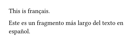
If your document contains text in multiple languages, you can use the text function or a scoped text set rule to enclose instances of other languages:
This is #text(lang: "fr")[français].

#[
  #set text(lang: "es")
  Este es un fragmento más largo
  del texto en español.
]
Document Title and Headings
Titling your document makes it easier to retrieve it and to navigate between it and other documents, both for AT users and regular users of PDF viewers. This is why accessibility standards such as WCAG and PDF/UA require you to set a machine-readable title for your document.
To do so in Typst, place this set rule in your document before any content:
#set document(title: "GlorboCorp Q1 2023 Revenue Report")
This will set the title in the document's metadata and in the title bar of the PDF viewer or web browser. If this results in an error when using a template, consider whether your template may provide an alternative way to set the document title.
Most likely, you will also want to include the title visibly in your document. To do so, use the title element. When you add a call to the title element without any arguments, it will print the contents of what you set as the document's title. Alternatively, you can customize the title by passing content as the positional body argument. Do not use the title element more than once in your document.
Never use a heading for your document title; instead, use the title element. Should you have experience with HTML, it is important to remember that the semantics of the heading element in Typst differ from HTML headings. It is encouraged to use multiple first-level headings for section headings in Typst documents. When exporting to HTML, a title will be serialized as a h1 tag while a first-level heading will be serialized as a h2 tag. In PDF export, the title and headings will be correctly tagged based on the PDF version targeted.
It is important that the sequence of headings you use is sequential: Never skip a heading level when going deeper. This means that a third-level heading must be followed by a heading of level four or lower, but never a heading of level five or higher.
// ❌ Don't do this:
= First level heading
=== Third level heading
Note that in order to pass the automated accessibility check in Adobe Acrobat, documents with 21 pages or more must contain outlined headings.
Accessibility Standards and Legislation
Typst can help you to assert that your document is accessible by checking it against international standards. For PDF export, there are multiple standards for accessible files, most notably the PDF/UA standard. Its first part (PDF/UA-1) is already supported by Typst while support for the second part (PDF/UA-2) is planned for the future. Below, you can find an explanation of all relevant standards:
-
Tagged PDF: Tagged PDFs contain machine-readable data about the semantic structure of a document that AT can parse. Typst will write Tagged PDFs by default, but keep in mind that Typst can only write appropriate tags if it knows about the semantic structure of your document. Refer to the Section Maintaining semantics to learn how to use Typst's elements to communicate semantics. To provide Universal Access, you are also responsible to provide textual representation of non-text content yourself.
-
PDF/UA-1: The PDF/UA standard explains how to write a PDF 1.7 file optimized for Universal Access. It implies Tagged PDF, enforces alternative descriptions for images and mathematics, requires a document title, and introduces rules how document contents like tables should be structured. If you are following this guide, you are already avoiding most of the compiler errors that can occur during PDF/UA-1 export.
-
PDF/UA-2: There is also the more recent part PDF/UA-2 that targets PDF 2.0 files. It improves accessibility for mathematics and some semantic elements. Support for PDF/UA-2 not yet available in Typst, but planned.
-
Well Tagged PDF (WTPDF): This is an industry standard that is very similar to PDF/UA-2. Like PDF/UA-2, it is not currently supported by Typst. Originally, it was drafted because both parts of the PDF/UA specification were only available at a high cost from the International Standards Organization. Hence, WTPDF was designed so that all conforming files can also declare conformance with PDF/UA-2. By now, both parts of the PDF/UA specification are available free of charge, decreasing the relevance of WTPDF.
-
PDF/A-1a: The PDF/A standard describes how to produce PDF files that are well-suited for archival. Parts one to three of the PDF/A standard feature multiple conformance levels. The strictest conformance level A contains rules for accessibility as only files meeting those rules remain usable to the broadest range of people in the far future. Level A implies conformance with Tagged PDF and forces you to provide alternative descriptions for images. Other PDF/A rules not relating to accessibility, e.g. about transparency, colors, and more also apply. This part of the PDF/A standard is based on the outdated PDF 1.4 specification. Only use it if your venue requires it or if you need a very compatible file. Otherwise, PDF/UA-1 and the second and third part of PDF/A provide better alternatives.
-
PDF/A-2a and PDF/A-3a: Like the first part of PDF/A, these standards focus on creating files suitable for archival and long-term storage. Both of these standards target the newer PDF version 1.7 instead of PDF 1.4. Here too, the strictest conformance level A contains rules for accessibility. In addition to the rules in PDF/A-1a, these standards disallow the use of characters in the Unicode Private Use Area whose meaning is not universally defined. Improvements over PDF/A-1 include the ability to use transparency and better reflow. When choosing between these two parts of the PDF/A standard, choose PDF/A-2a unless you need to attach other files. Note that conformance level A has been removed from PDF/A-4 in favor of the dedicated PDF/UA standard.
The PDF reference page contains more information about each supported standard. To enable either PDF/UA, PDF/A-2a, or PDF/A-3a, use the appropriate flag in the CLI or use the export dropdown and click on PDF in the web app.
When you select one of these standards for PDF export, Typst will detect if you are in violation of their rules and fail the export with a descriptive error message. For the strictest accessibility check currently available, choose PDF/UA-1. Do not disable tagging unless you have a good reason, as tags provide a baseline of accessibility across all documents you export.
Maybe you already noticed that some of the factors that go into Universal Access are hard to check automatically. For example, Typst will currently not automatically check that your color contrasts are sufficient or whether the configured natural language matches the actual natural language (although the amount of spellcheck errors should provide a hint if you are using the web app). There are two international standards that address some of these human factors in more detail:
- The Web Content Accessibility Guidelines (WCAG): Designed by the W3C, a big international consortium behind the technologies that power the internet, WCAG describes how to make a web site accessible. All of these rules are applicable to Typst's HTML output, and many of them apply to its PDF output. WCAG separates its rules into the three levels A, AA, and AAA. It is recommended that normal documents aim for AA. If you have high standards for Universal Access, you can also consider AAA Success Criteria. However, Typst does not yet expose all PDF features needed for AAA compliance, e.g. an AT-accessible way to define expansions for abbreviations.
- The European Norm EN 301 549: Its Section 9 describes how to create accessible websites and its Section 10 describes what rules apply to non-web documents, including PDFs created by Typst. It points out which WCAG clauses are also applicable to PDFs. Conformance with this standard is a good start for complying with EU and national accessibility laws.
Keep in mind that in order to conform with EN 301 549 and the relevant WCAG provisions, your document must be tagged. If you aim for conformance, we strongly suggest using PDF/UA-1 for export to automate many of the checks for the success criteria within.
Many territories have accessibility legislation that requires you to create accessible files under some circumstances. Here are only some of them:
- European Accessibility Act (EAA, EU 2019/882): This regulation applies to e-books, consumer banking services, e-commerce services, and more. It requires the files distributed in these applications to be accessible.
- Americans with Disabilities Act (ADA): The Department of Justice will require public sector organizations to provide files in accordance to WCAG under Title II of the ADA by 2026. Likewise, private organizations can be held liable for inaccessible digital services under the ADA and state law.
Using this guide can help you reach compliance with either regulation.
Testing for Accessibility
In order to test whether your PDF document is accessible, you can use automated tools and manual testing. Some standards like PDF/UA and PDF/A can be checked exclusively through automated tools, while some rules in WCAG and other standards require manual checks. Many of the automatable checks are automatically passed by Typst when Tagged PDF is enabled. For many other automatable checks, you can enable PDF/UA-1 export so that Typst will run them instead. Automated tools can only provide a baseline of accessibility. For truly Universal Access, it is best if you try the document yourself with AT.
Here is a list of automated checkers to try to test for conformance:
-
veraPDF: This open-source tool can check if your PDF file conforms to the parts of the PDF/A and PDF/UA standards it declared conformance with. Use this tool if you have chosen one of these standards during export. Failures are considered bugs in Typst and should be reported on GitHub.
-
PDF Accessibility Checker (PAC): The freeware PAC checks whether your document complies with PDF/UA and WCAG rules. When you receive a hard error in the PDF/UA tab, this is considered a bug in Typst and should be reported on GitHub. Warnings in the PDF/UA and Quality tabs may either be bugs, problems in your document, or neither. Check on the Forum or on Discord if you are unsure. Errors and warnings in the WCAG tab indicate problems with your document.
-
Accessibility Check in Adobe Acrobat Pro: The accessibility checker in the paid version of Adobe Acrobat checks all PDF documents for problems. Instead of checking compliance with a well-known international or industry standard, Adobe has created their own suite of tests. Because the rules behind these tests sometimes contradict international standards like PDF/UA, some of Acrobat's checks are expected to fail for Typst documents2. Other checks, such as the contrast check are useful and indicate problems with your document.
When doing manual checking, you can start with a checklist. If your organization places emphasis on accessibility, they will sometimes have their own list. In absence of one, you can try lists by universities such as Universität Bremen (in English) or governments such as in Canada or by the US Social Security Administration. Although these checklists differ in verbosity, they all cover the most essential manual checks. Many of the technical checks in them can be skipped if you choose PDF/UA-1 export in Typst. If unsure which checklist to use, choose one from an organization culturally similar to yours.
However, to reach the highest standard of accessibility for widely circulated documents, consider checking your document with AT. Although there are many AT products and PDF viewers, it is typically sufficient to test a single combination. Which is best differs depending on your operating system:
- Windows: Test with Adobe Acrobat and NVDA. NVDA is free, open-source software. A free version of Acrobat is available.
- macOS: Test with Adobe Acrobat and VoiceOver. VoiceOver is the screen reader that is built into macOS and other Apple platforms.
- Linux: Test with Evince or Okular and Orca. All three tools are free, open-source software. However, AT support across Linux platforms lags behind what is available on Windows and macOS. Likewise, Evince and Okular have less accessibility support than Acrobat. We strongly suggest testing with Acrobat instead.
When first getting into testing, consider completing the interactive training program your screen reader offers, if any. Building confidence with a screen reader helps you experience your document like a full-time screen reader user. When checking your document, check that it not only makes all the same information accessible that is available to a sighted user, but also that it is easy to navigate. The experience your users will have will vary based on the pairing of PDF viewer and AT they use.
Limits and considerations for export formats
Even when you design your document with accessibility in mind, you should be aware of the limitations of your export format. Fundamentally, AT support for PDF files is more difficult to implement than for other formats such as HTML. PDF was conceived in 1993 to accurately render print documents on a computer. Accessibility features were first added with PDF 1.4 in 2001, and improved in PDF 1.5 (2003) and PDF 2.0 (2017). By contrast, HTML offers a richer semantic model and more flexibility, so AT support in browsers generally surpasses what is possible in PDF viewers.
Also keep in mind that PDF files are mostly static. This allows you to disregard many WCAG and EN 301 549 rules designed for interactive content and multimedia. However, the lack of interactivity also makes it more difficult for users to customize a document's layout to their needs.
For example, WCAG Success Criterion 1.4.12 (codified in Clause 10.1.4.12 of EN 301 549) prescribes that a user must be able to increase character, letter, line, and paragraph spacing to very wide values. This benefits users with reduced vision or dyslexia. The Success Criterion does not require you to design your document with these layout parameters. Instead, it only requires a mechanism through which users can increase these parameters when reading the document. For HTML files, it is easy to comply with this Success Criterion because the browser lets the user override these spacing parameters on a page. For PDF, the situation is more nuanced: Theoretically, Typst adds tags and attributes designed for reflow to a file. A PDF reader, when reflowing, could allow its user to increase spacings beyond what is codified in these tags. In practice, we are not aware of a PDF viewer with this feature. Instead, this Success Criterion can be satisfied by repurposing the PDF into a HTML file and opening it in a browser.
In practice, even if your file is technically compliant, you cannot expect your users to know about these workarounds. Therefore, if you are aiming to meet the highest standards of Universal Access, consider distributing an HTML version of your document alongside your PDF. Export this file directly using Typst's HTML export (in preview). Even though HTML export will not conserve many aspects of your visual layout, it will produce a file that leverages semantic HTML and technologies like Digital Publishing ARIA to provide Universal Access. It will be of a higher quality than a PDF file repurposed to HTML.
Finally, keep in mind that PDFs are designed for print. Hence, you should not assume that interactive features like links are available to users who chose to print your document.
As mentioned above, files created by PNG and SVG export are not accessible.
Dataset from the German Federal Statistics Authority (Statistisches Bundesamt, Destatis). "Bruttostromerzeugung nach Energieträgern in Deutschland ab 1990", 2025, available under the Data licence Germany – attribution – version 2.0.
For example, when using footnotes, the check "Lbl and LBody must be children of LI" in the "List" section is expected to fail.