tableElement
A table of items.
Tables are used to arrange content in cells. Cells can contain arbitrary content, including multiple paragraphs and are specified in row-major order. For a hands-on explanation of all the ways you can use and customize tables in Typst, check out the Table Guide.
Because tables are just grids with different defaults for some cell properties (notably stroke and inset), refer to the grid documentation for more information on how to size the table tracks and specify the cell appearance properties.
If you are unsure whether you should be using a table or a grid, consider whether the content you are arranging semantically belongs together as a set of related data points or similar or whether you are just want to enhance your presentation by arranging unrelated content in a grid. In the former case, a table is the right choice, while in the latter case, a grid is more appropriate. Furthermore, Assistive Technology (AT) like screen readers will announce content in a table as tabular while a grid’s content will be announced no different than multiple content blocks in the document flow. AT users will be able to navigate tables two-dimensionally by cell.
Note that, to override a particular cell’s properties or apply show rules on table cells, you can use the table.cell element. See its documentation for more information.
Although the table and the grid share most properties, set and show rules on one of them do not affect the other. Locating most of your styling in set and show rules is recommended, as it keeps the table’s actual usages clean and easy to read. It also allows you to easily change the appearance of all tables in one place.
To give a table a caption and make it referenceable, put it into a figure.
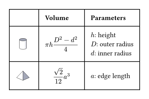
Example
The example below demonstrates some of the most common table options.
#table(
columns: (1fr, auto, auto),
inset: 10pt,
align: horizon,
table.header(
[], [*Volume*], [*Parameters*],
),
image("cylinder.svg"),
$ pi h (D^2 - d^2) / 4 $,
[
$h$: height \
$D$: outer radius \
$d$: inner radius
],
image("tetrahedron.svg"),
$ sqrt(2) / 12 a^3 $,
[$a$: edge length]
)
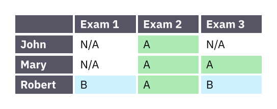
Much like with grids, you can use table.cell to customize the appearance and the position of each cell.
#set table(
stroke: none,
gutter: 0.2em,
fill: (x, y) =>
if x == 0 or y == 0 { gray },
inset: (right: 1.5em),
)
#show table.cell: it => {
if it.x == 0 or it.y == 0 {
set text(white)
strong(it)
} else if it.body == [] {
// Replace empty cells with 'N/A'
pad(..it.inset)[_N/A_]
} else {
it
}
}
#let a = table.cell(
fill: green.lighten(60%),
)[A]
#let b = table.cell(
fill: aqua.lighten(60%),
)[B]
#table(
columns: 4,
[], [Exam 1], [Exam 2], [Exam 3],
[John], [], a, [],
[Mary], [], a, a,
[Robert], b, a, b,
)
Accessibility
Tables are challenging to consume for users of Assistive Technology (AT). To make the life of AT users easier, we strongly recommend that you use table.header and table.footer to mark the header and footer sections of your table. This will allow AT to announce the column labels for each cell.
Because navigating a table by cell is more cumbersome than reading it visually, you should consider making the core information in your table available as text as well. You can do this by wrapping your table in a figure and using its caption to summarize the table’s content.
Parameters
columnsDefault: ()
The column sizes. See the grid documentation for more information on track sizing.
rowsDefault: ()
The row sizes. See the grid documentation for more information on track sizing.
gutterDefault: ()
The gaps between rows and columns. This is a shorthand for setting column-gutter and row-gutter to the same value. See the grid documentation for more information on gutters.
column-gutterDefault: ()
The gaps between columns. Takes precedence over gutter. See the grid documentation for more information on gutters.
row-gutterDefault: ()
The gaps between rows. Takes precedence over gutter. See the grid documentation for more information on gutters.
insetDefault: 0% + 5pt
How much to pad the cells’ content.
To specify the same inset for all cells, use a single length for all sides, or a dictionary of lengths for individual sides. See the box’s documentation for more details.
To specify a varying inset for different cells, you can:
- use a single, uniform inset for all cells
- use an array of insets for each column
- use a function that maps a cell’s X/Y position (both starting from zero) to its inset
See the grid documentation for more details.
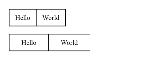
 View example
#table(
columns: 2,
inset: 10pt,
[Hello],
[World],
)
#table(
columns: 2,
inset: (x: 20pt, y: 10pt),
[Hello],
[World],
)
alignDefault: auto
How to align the cells’ content.
If set to auto, the outer alignment is used.
You can specify the alignment in any of the following fashions:
- use a single alignment for all cells
- use an array of alignments corresponding to each column
- use a function that maps a cell’s X/Y position (both starting from zero) to its alignment
See the Table Guide for details.
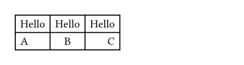
View example
#table(
columns: 3,
align: (left, center, right),
[Hello], [Hello], [Hello],
[A], [B], [C],
)
fillDefault: none
How to fill the cells.
This can be:
- a single fill for all cells
- an array of fill corresponding to each column
- a function that maps a cell’s position to its fill
Most notably, arrays and functions are useful for creating striped tables. See the Table Guide for more details.
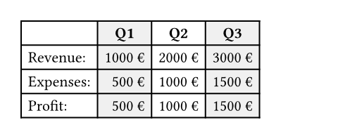
View example
#table(
fill: (x, _) =>
if calc.odd(x) { luma(240) }
else { white },
align: (x, y) =>
if y == 0 { center }
else if x == 0 { left }
else { right },
columns: 4,
[], [*Q1*], [*Q2*], [*Q3*],
[Revenue:], [1000 €], [2000 €], [3000 €],
[Expenses:], [500 €], [1000 €], [1500 €],
[Profit:], [500 €], [1000 €], [1500 €],
)
strokeDefault: 1pt + black
How to stroke the cells.
Strokes can be disabled by setting this to none.
If it is necessary to place lines which can cross spacing between cells produced by the gutter option, or to override the stroke between multiple specific cells, consider specifying one or more of table.hline and table.vline alongside your table cells.
To specify the same stroke for all cells, use a single stroke for all sides, or a dictionary of strokes for individual sides. See the rectangle’s documentation for more details.
To specify varying strokes for different cells, you can:
- use a single stroke for all cells
- use an array of strokes corresponding to each column
- use a function that maps a cell’s position to its stroke
See the Table Guide for more details.
children
The contents of the table cells, plus any extra table lines specified with the table.hline and table.vline elements.
Definitions
cellElement
A cell in the table. Use this to position a cell manually or to apply styling. To do the latter, you can either use the function to override the properties for a particular cell, or use it in show rules to apply certain styles to multiple cells at once.
Perhaps the most important use case of table.cell is to make a cell span multiple columns and/or rows with the colspan and rowspan fields.
View example
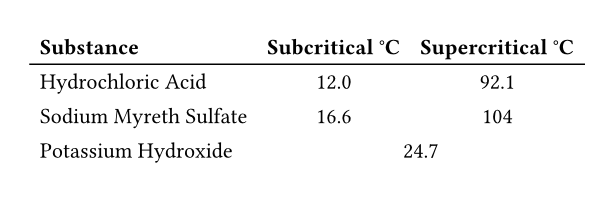
#show table.cell.where(y: 0): strong
#set table(
stroke: (x, y) => if y == 0 {
(bottom: 0.7pt + black)
},
align: (x, y) => (
if x > 0 { center }
else { left }
)
)
#table(
columns: 3,
table.header(
[Substance],
[Subcritical °C],
[Supercritical °C],
),
[Hydrochloric Acid],
[12.0], [92.1],
[Sodium Myreth Sulfate],
[16.6], [104],
[Potassium Hydroxide],
table.cell(colspan: 2)[24.7],
)
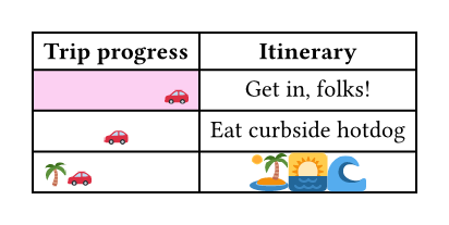
For example, you can override the fill, alignment or inset for a single cell:
View example
// You can also import those.
#import table: cell, header
#table(
columns: 2,
align: center,
header(
[*Trip progress*],
[*Itinerary*],
),
cell(
align: right,
fill: fuchsia.lighten(80%),
[🚗],
),
[Get in, folks!],
[🚗], [Eat curbside hotdog],
cell(align: left)[🌴🚗],
cell(
inset: 0.06em,
text(1.62em)[🏝️🌅🌊],
),
)
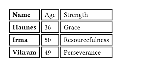
You may also apply a show rule on table.cell to style all cells at once. Combined with selectors, this allows you to apply styles based on a cell’s position:
View example
#show table.cell.where(x: 0): strong
#table(
columns: 3,
gutter: 3pt,
[Name], [Age], [Strength],
[Hannes], [36], [Grace],
[Irma], [50], [Resourcefulness],
[Vikram], [49], [Perseverance],
)
body
The cell’s body.
xDefault: auto
The cell’s column (zero-indexed). Functions identically to the x field in grid.cell.
yDefault: auto
The cell’s row (zero-indexed). Functions identically to the y field in grid.cell.
colspanDefault: 1
The amount of columns spanned by this cell.
rowspanDefault: 1
The amount of rows spanned by this cell.
insetDefault: auto
The cell’s inset override.
alignDefault: auto
The cell’s alignment override.
fillDefault: auto
The cell’s fill override.
strokeDefault: (:)
The cell’s stroke override.
breakableDefault: auto
Whether rows spanned by this cell can be placed in different pages. When equal to auto, a cell spanning only fixed-size rows is unbreakable, while a cell spanning at least one auto-sized row is breakable.
hlineElement
A horizontal line in the table.
Overrides any per-cell stroke, including stroke specified through the table’s stroke field. Can cross spacing between cells created through the table’s column-gutter option.
Use this function instead of the table’s stroke field if you want to manually place a horizontal line at a specific position in a single table. Consider using table’s stroke field or table.cell’s stroke field instead if the line you want to place is part of all your tables’ designs.
View example
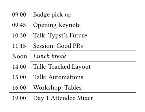
#set table.hline(stroke: .6pt)
#table(
stroke: none,
columns: (auto, 1fr),
[09:00], [Badge pick up],
[09:45], [Opening Keynote],
[10:30], [Talk: Typst's Future],
[11:15], [Session: Good PRs],
table.hline(start: 1),
[Noon], [_Lunch break_],
table.hline(start: 1),
[14:00], [Talk: Tracked Layout],
[15:00], [Talk: Automations],
[16:00], [Workshop: Tables],
table.hline(),
[19:00], [Day 1 Attendee Mixer],
)
yDefault: auto
The row above which the horizontal line is placed (zero-indexed). Functions identically to the y field in grid.hline.
startDefault: 0
The column at which the horizontal line starts (zero-indexed, inclusive).
endDefault: none
The column before which the horizontal line ends (zero-indexed, exclusive).
strokeDefault: 1pt + black
The line’s stroke.
Specifying none removes any lines previously placed across this line’s range, including hlines or per-cell stroke below it.
positionDefault: top
The position at which the line is placed, given its row (y) - either top to draw above it or bottom to draw below it.
This setting is only relevant when row gutter is enabled (and shouldn’t be used otherwise - prefer just increasing the y field by one instead), since then the position below a row becomes different from the position above the next row due to the spacing between both.
vlineElement
A vertical line in the table. See the docs for grid.vline for more information regarding how to use this element’s fields.
Overrides any per-cell stroke, including stroke specified through the table’s stroke field. Can cross spacing between cells created through the table’s row-gutter option.
Similar to table.hline, use this function if you want to manually place a vertical line at a specific position in a single table and use the table’s stroke field or table.cell’s stroke field instead if the line you want to place is part of all your tables’ designs.
xDefault: auto
The column before which the vertical line is placed (zero-indexed). Functions identically to the x field in grid.vline.
startDefault: 0
The row at which the vertical line starts (zero-indexed, inclusive).
endDefault: none
The row on top of which the vertical line ends (zero-indexed, exclusive).
strokeDefault: 1pt + black
The line’s stroke.
Specifying none removes any lines previously placed across this line’s range, including vlines or per-cell stroke below it.
positionDefault: start
The position at which the line is placed, given its column (x) - either start to draw before it or end to draw after it.
The values left and right are also accepted, but discouraged as they cause your table to be inconsistent between left-to-right and right-to-left documents.
This setting is only relevant when column gutter is enabled (and shouldn’t be used otherwise - prefer just increasing the x field by one instead), since then the position after a column becomes different from the position before the next column due to the spacing between both.
headerElement
A repeatable table header.
You should wrap your tables’ heading rows in this function even if you do not plan to wrap your table across pages because Typst uses this function to attach accessibility metadata to tables and ensure Universal Access to your document.
You can use the repeat parameter to control whether your table’s header will be repeated across pages.
Currently, this function is unsuitable for creating a header column or single header cells. Either use regular cells, or, if you are exporting a PDF, you can also use the pdf.header-cell function to mark a cell as a header cell. Likewise, you can use pdf.data-cell to mark cells in this function as data cells. Note that these functions are not final and thus only available when you enable the a11y-extras feature (see the PDF module documentation for details).
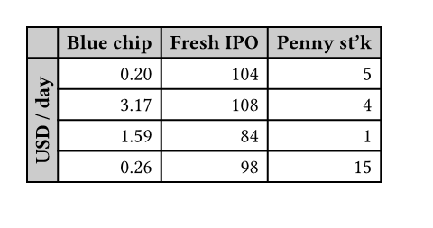
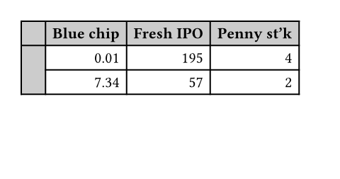
View example
#set page(height: 11.5em)
#set table(
fill: (x, y) =>
if x == 0 or y == 0 {
gray.lighten(40%)
},
align: right,
)
#show table.cell.where(x: 0): strong
#show table.cell.where(y: 0): strong
#table(
columns: 4,
table.header(
[], [Blue chip],
[Fresh IPO], [Penny st'k],
),
table.cell(
rowspan: 6,
align: horizon,
rotate(-90deg, reflow: true)[
*USD / day*
],
),
[0.20], [104], [5],
[3.17], [108], [4],
[1.59], [84], [1],
[0.26], [98], [15],
[0.01], [195], [4],
[7.34], [57], [2],
)
repeatDefault: true
Whether this header should be repeated across pages.
levelDefault: 1
The level of the header. Must not be zero.
This allows repeating multiple headers at once. Headers with different levels can repeat together, as long as they have ascending levels.
Notably, when a header with a lower level starts repeating, all higher or equal level headers stop repeating (they are “replaced” by the new header).
children
The cells and lines within the header.
footerElement
A repeatable table footer.
Just like the table.header element, the footer can repeat itself on every page of the table. This is useful for improving legibility by adding the column labels in both the header and footer of a large table, totals, or other information that should be visible on every page.
No other table cells may be placed after the footer.
repeatDefault: true
Whether this footer should be repeated across pages.
children
The cells and lines within the footer.