squareElement
A square with optional content.
Example
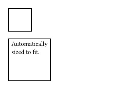
// Without content.
#square(size: 40pt)
// With content.
#square[
Automatically \
sized to fit.
]
Parameters
sizeDefault: auto
The square’s side length. This is mutually exclusive with width and height.
widthDefault: auto
The square’s width. This is mutually exclusive with size and height.
In contrast to size, this can be relative to the parent container’s width.
heightDefault: auto
The square’s height. This is mutually exclusive with size and width.
In contrast to size, this can be relative to the parent container’s height.
fillDefault: none
How to fill the square. See the rectangle’s documentation for more details.
strokeDefault: auto
How to stroke the square. See the rectangle’s documentation for more details.
radiusDefault: (:)
How much to round the square’s corners. See the rectangle’s documentation for more details.
insetDefault: 0% + 5pt
How much to pad the square’s content. See the box’s documentation for more details.
outsetDefault: (:)
How much to expand the square’s size without affecting the layout. See the box’s documentation for more details.
bodyDefault: none
The content to place into the square. The square expands to fit this content, keeping the 1-1 aspect ratio.
When this is omitted, the square takes on a default size of at most 30pt.