blockElement
A block-level container.
Such a container can be used to separate content, size it, and give it a background or border.
Blocks are also the primary way to control whether text becomes part of a paragraph or not. See the paragraph documentation for more details.
Examples
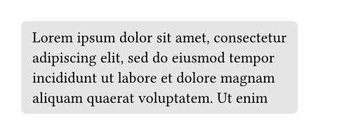
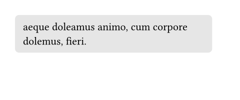
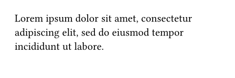
With a block, you can give a background to content while still allowing it to break across multiple pages.
#set page(height: 100pt)
#block(
  fill: luma(230),
  inset: 8pt,
  radius: 4pt,
  lorem(30),
)
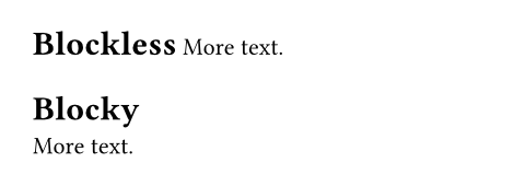
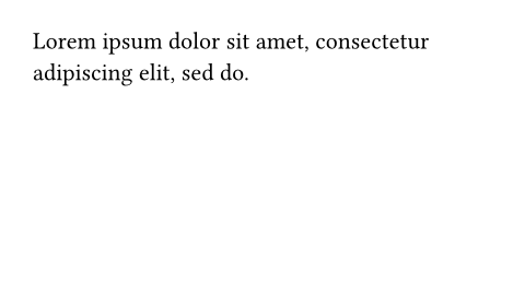
Blocks are also useful to force elements that would otherwise be inline to become block-level, especially when writing show rules.
#show heading: it => it.body
= Blockless
More text.

#show heading: it => block(it.body)
= Blocky
More text.
Parameters
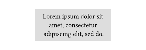
width
The block's width.
 View example
#set align(center)
#block(
  width: 60%,
  inset: 8pt,
  fill: silver,
  lorem(10),
)
Default: auto
height
The block's height. When the height is larger than the remaining space
on a page and breakable is true, the
block will continue on the next page with the remaining height.
View example
#set page(height: 80pt)
#set align(center)
#block(
  width: 80%,
  height: 150%,
  fill: aqua,
)


Default: auto
breakable
Whether the block can be broken and continue on the next page.
View example
#set page(height: 80pt)
The following block will
jump to its own page.
#block(
  breakable: false,
  lorem(15),
)
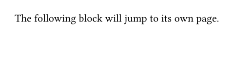
Default: true
fill
The block's background color. See the rectangle's documentation for more details.
Default: none
stroke
The block's border color. See the rectangle's documentation for more details.
Default: (:)
radius
How much to round the block's corners. See the rectangle's documentation for more details.
Default: (:)
inset
How much to pad the block's content. See the box's documentation for more details.
Default: (:)
outset
How much to expand the block's size without affecting the layout. See the box's documentation for more details.
Default: (:)
spacing
The spacing around the block. When auto, inherits the paragraph
spacing.
For two adjacent blocks, the larger of the first block's above and the
second block's below spacing wins. Moreover, block spacing takes
precedence over paragraph spacing.
Note that this is only a shorthand to set above and below to the
same value. Since the values for above and below might differ, a
context block only provides access to block.above and
block.below, not to block.spacing directly.
This property can be used in combination with a show rule to adjust the spacing around arbitrary block-level elements.
View example
#set align(center)
#show math.equation: set block(above: 8pt, below: 16pt)

This sum of $x$ and $y$:
$ x + y = z $
A second paragraph.

Default: 1.2em
above
The spacing between this block and its predecessor.
Default: auto
below
The spacing between this block and its successor.
Default: auto
clip
Whether to clip the content inside the block.
Clipping is useful when the block's content is larger than the block itself, as any content that exceeds the block's bounds will be hidden.
View example
#block(
  width: 50pt,
  height: 50pt,
  clip: true,
  image("tiger.jpg", width: 100pt, height: 100pt)
)

Default: false
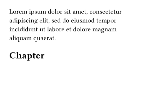
sticky
Whether this block must stick to the following one, with no break in between.
This is, by default, set on heading blocks to prevent orphaned headings at the bottom of the page.
View example
// Disable stickiness of headings.
#show heading: set block(sticky: false)
#lorem(20)

= Chapter
#lorem(10)
Default: false
body
The contents of the block.
Default: none